

.jpg)
.jpg)
.jpg)
.jpeg)
.png)
.png)
.png)
.png)
.png)
.jpeg)
.jpeg)
.jpeg)
%2520(1).png)


.avif)


.png)

.png)
.png)


.png)
![Agent Server [1/3]: Where Enterprise AI Agents Live, Work, and Scale](https://cdn.prod.website-files.com/67bef0c56c3781a827a0f375/69c14b6f967d2ae5279adcea_690e4d0f068d3ec27aea7ae0_123%2520(1).png)
![Agent Server [2/3]: Where Should Your Agent Server Run?](https://cdn.prod.website-files.com/67bef0c56c3781a827a0f375/69c14b6f967d2ae5279adcf0_690e646b6e0366d090fbc37f_wdxczxgr-1.png)
![Agent Server [3/3]: Agent Access Control Explained: RBAC, Caller Limits, and Safer A2A](https://cdn.prod.website-files.com/67bef0c56c3781a827a0f375/69c14b56c87a1735a82bac8d_69132a45740300abc320bc7f_Cover_%2520RBAC%2520for%2520Agents%252C%2520Done%2520Right2%2520(1).png)
.png)
.jpeg)
.png)

%25201%2520(1).jpeg)

%25201%2520(1).jpeg)
.jpeg)
.jpeg)
July 16, 2026
The Agentic Control Plane for Data Engineering

Healthcare price transparency is now an operational data problem, not just a reporting problem. Hospitals have been subject to Hospital Price Transparency requirements since January 1, 2021, health plans and issuers have been publishing Transparency in Coverage machine-readable files since 2022, and regulators spent 2025-2026 tightening comparability and data-quality requirements through new hospital rules and proposed payer updates.
That changes the technical requirement. Rate analytics still matter, but teams also need anomaly detection, machine-readable-file pipeline monitoring, and compliance scoring in the same system. A dashboard can show rates. A command center can tell you whether the data arrived, whether the rates look wrong, and where enforcement risk is building.
Healthcare price transparency became an operational problem once the rules required recurring, machine-readable publication instead of one-time disclosure. Hospitals now publish standard charges in both machine-readable and consumer-friendly formats, while plans and issuers maintain public Transparency in Coverage files. CMS’s 2025-2026 updates show that regulators now care about comparability, timeliness, and data quality.
On the hospital side, the federal Hospital Price Transparency rule has applied since January 1, 2021. Hospitals must publish a comprehensive machine-readable file and a consumer-friendly display of at least 300 shoppable services, including as many of the 70 CMS-specified services as they offer. In late 2025, CMS finalized additional 2026 hospital price transparency requirements aimed at more meaningful and comparable disclosures, and the technical obligations remain codified in 45 CFR Part 180.
On the payer side, the 2020 Transparency in Coverage final rule created public machine-readable-file requirements for in-network negotiated rates and out-of-network allowed amounts and billed charges. The rule also contemplated a prescription-drug file, but the Departments later deferred enforcement of that requirement pending further rulemaking. In December 2025, the Departments proposed additional changes to reduce file size, improve standardization, and make the disclosures more usable for analysis.
Compliance remains uneven depending on the measurement method. A 2024 GAO report cited CMS’s estimate that hospital compliance rose from 27% in February 2021 to 70% in November 2022, but HHS OIG’s 2024 audit found 37 of 100 sampled hospitals noncompliant and estimated that 46% of the 5,879 hospitals subject to the rule did not meet public-disclosure requirements. Patient Rights Advocate’s November 2024 review of 2,000 hospitals found 21.1% full compliance under its stricter methodology. Regardless of which scorecard an organization uses, the burden is clearly ongoing rather than resolved.
A workable healthcare price transparency program combines four capabilities: rate analytics, anomaly detection, machine-readable-file pipeline monitoring, and regulatory compliance scoring. These capabilities answer different operational questions, but they are interdependent. If the file failed to arrive, the benchmark chart is stale. If the rate is an outlier, the compliance score may be misleading.
Rate analytics is the most visible layer because it supports the questions leaders already know how to ask. What is our negotiated rate for a specific CPT or HCPCS code compared with a CMS or Medicare benchmark? Which payer is highest for common ambulatory procedures? How does one region or provider system compare with another?
That layer matters because price dispersion in U.S. healthcare is still material. RAND reported that private plans and employers paid hospitals 254% of what Medicare would have paid in 2022, with wide variation across states and hospital systems. KFF’s hospital pricing review similarly notes that commercial-to-Medicare price ratios vary substantially across markets.
Traditional BI is strong here. Once the data is modeled, a dashboard can segment rates by payer, procedure, provider, and geography. The problem is that this layer only answers what the data says. It does not answer whether the underlying data is late, malformed, or statistically suspect.
Anomaly detection answers a more important question than most dashboards can: which numbers should not be trusted at face value? KFF’s review of Transparency in Coverage data documented misleading and unlikely prices, inconsistencies, and other oddities that complicate downstream analysis. In practice, that means some apparent pricing insights are actually data-quality problems wearing the clothes of analytics.
A price transparency program therefore needs explicit statistical logic - not just filters and charts. IQR fencing can identify values beyond 1.5 times the interquartile range. Z-scores can quantify severity. Residual analysis can highlight rates that do not fit expected patterns after controlling for payer, region, and procedure type.
Without that layer, a rate that is genuinely unusual and a rate that is simply wrong appear identical in a table. One may represent a contract opportunity. The other may represent a stale file, a mapping issue, or a broken ingest. A dashboard can visualize both. It cannot, by itself, separate them.
Pipeline monitoring answers whether the data supply chain is healthy enough for the analytics layer to be trusted. For health-plan machine-readable files, that means more than checking whether a URL resolves. Teams need to know when the file appeared, whether the schema changed, whether parsing succeeded, whether record counts shifted abnormally, and whether the warehouse was refreshed inside an agreed SLA window.
That operational burden is now part of the regulatory record. The Departments’ December 2025 proposed rule explicitly acknowledged that many users struggle to keep up with downloading, ingesting, analyzing, and storing the current public files. The proposal to reduce file size and change reporting cadence was itself evidence that price transparency has become a data-engineering problem, not just a publication problem.
If a payer’s file fails to parse on Tuesday and nobody notices until Friday, every dashboard view built on that source is stale even if the charts still load perfectly. That is why pipeline state has to sit next to rate analytics rather than in a separate engineering console that business users never see.
Compliance scoring turns legal requirements into an operational state. A payer or hospital may have published a file but still be exposed because the file is late, hard to discover, incomplete, nonconforming, or missing required elements. Hospitals, for example, now have increasingly specific technical requirements around templates, site discoverability, .txt files, attestations, and machine-readable-file structure, as CMS explains in its 2024 hospital price transparency fact sheet and Hospital Price Transparency resources.
That logic does not fit cleanly into a standard BI metric model. Compliance is a scored state that requires rules, thresholds, time windows, and domain interpretation. Leadership needs to see not only whether rates look competitive, but also whether the supporting disclosures are timely, valid, and defensible in the current quarter.
In most organizations, that logic ends up in spreadsheets, SQL scripts, or ad hoc quarterly reviews. The result is predictable: the rate dashboard, the parser logs, and the compliance workbook all disagree slightly and nobody is sure which one leadership should trust.
Traditional BI is still the right tool for dimensional exploration of clean, modeled data. The problem is that healthcare price transparency data is rarely clean, static, or self-validating. The structural gap is not visual design. The gap is that BI assumes the warehouse is correct before the analysis begins.
A dashboard is excellent at slicing rates by payer, procedure, and geography. It is not designed to decide whether a given value is statistically abnormal and worthy of triage. That judgment requires a separate analytical layer with explicit thresholds, severity logic, and operational routing.
In price transparency work, this distinction matters because a single outlier can distort rate comparisons, median calculations, and executive summaries. In the Genesis demonstration below, the anomaly layer flagged 90 of 765 negotiated rates - 11.8% of the dataset - for review. The moment teams care about “which rates should we investigate?” they have left the native comfort zone of traditional BI.
BI tools generally assume that whatever is in the warehouse is current enough to analyze. Healthcare price transparency violates that assumption. Files arrive on different cadences, move locations, change schema, and sometimes publish implausible or incomplete values. If the ingest layer is not visible in the same experience as the analytics, users are left making decisions without freshness context.
The Departments’ own proposed TiC updates underscore the point. They cite the operational burden associated with preparing, ingesting, analyzing, and storing the files. That is effectively a public acknowledgment that the “dashboard only” model is incomplete for this use case.
Compliance is not a simple aggregate from a fact table. It is a time-based state with rule changes, validation logic, and penalty implications. A payer with strong submission coverage but poor validation quality is different from a payer with missing files but clean schema conformance. Both may show up as “80-something percent” in a flat scorecard, yet their operational risk is not the same.
That is why price transparency needs a command-center model. A dashboard answers, “What do the rates say?” A command center also answers, “Did the file arrive?”, “Which values look wrong?”, and “What is our exposure this quarter?”
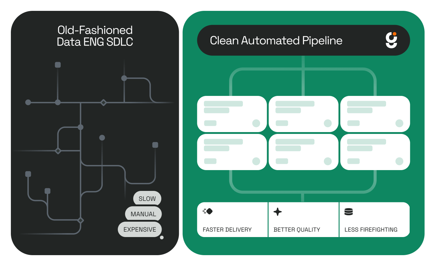
In a Genesis demonstration, the replacement for a dashboard was a healthcare price transparency command center built by Genesis Data Agent Eve. The goal was not to create prettier charts. The goal was to unify data-model design, analytics, anomaly detection, pipeline monitoring, compliance logic, deployment, and documentation inside one governed mission.
The build used synthetic but realistic data, real payer and procedure naming, and a live deployment target on Snowflake. The system was designed to show what happens when the four operational capabilities above are treated as one governed workflow instead of four disconnected workstreams. That governed approach is the same pattern Genesis describes in Blueprints: How We Teach Agents to Work the Way Data Engineers Do.
First, the data model was designed for operations rather than screenshots. The negotiated-rates table did not exist alone. It was joined to the entities needed to explain and govern the rates: payer, provider, geography, procedure, anomaly status, pipeline history, and compliance posture.
Second, the dashboard and the statistical layer shared the same context. An analyst looking at a rate comparison could immediately see whether a rate had been flagged as a high-severity outlier. That removes the handoff where anomaly detection happens in a separate notebook that never reaches the dashboard user.
Third, pipeline health became part of the analytical experience. The same environment that showed rate trends also showed whether the underlying file arrived on time, parsed successfully, and refreshed within SLA. That is the operational bridge traditional BI usually leaves disconnected.
Fourth, the system produced narrative insight in addition to charts. Instead of forcing leaders to infer every conclusion manually, the command center generated natural-language summaries from the current filtered state. That makes the system more useful to executives without stripping away the detail analysts need.
The practical value of a command center is not prettier reporting. It is shared operational context. When analytics, data quality, pipeline reliability, and compliance risk live in one system, teams can act on the same facts at the same time.
A command center shortens the distance between a failed ingest and the downstream decision it affects. If a payer file did not parse this week, the rate analyst sees that immediately instead of discovering the issue after a strange chart appears in a QBR deck. That reduces silent-data-failure risk, which is often the most expensive failure mode and is closely related to the broader operating risk described in Your Data Backlog Isn’t Just a List - It’s a Risk Ledger.
A command center replaces quarterly spreadsheet rituals with live scoring. That matters because the work is no longer limited to “did we post a file?” It is now about whether the file is discoverable, technically conformant, timely, and complete enough to withstand regulator review under updated standards.
The more interesting point is architectural. The same agent that designed the data model also implemented the anomaly logic, wired the filters, surfaced the pipeline state, and produced documentation. The result is not just speed. It is coherence. The components fit because they were built as one governed mission instead of four separate projects stitched together at the end.
This is where autonomous data agents differ from coding assistants. A coding assistant can help write a chart or a query. An autonomous data agent can inventory the environment, pick a deployment target, build across domains, validate the results, and leave an auditable trail. That is the same enterprise pattern Genesis applies in its Data Engineer Agents offering.
Teams evaluating healthcare price transparency tooling usually ask the same questions: Is a dashboard enough? What has to be monitored? Where does compliance live? The short answer is that dashboards remain useful, but only inside a broader operational system that tracks freshness, anomalies, and regulatory state in the same decision surface.
A dashboard is necessary but not sufficient. It can show negotiated rates, benchmark comparisons, and historical trends, but it usually cannot tell users whether the source file arrived on time, whether a value is statistically abnormal, or whether the organization’s disclosure posture is compliant this quarter.
A command center should monitor at least four things together: benchmarked rates, anomaly flags, machine-readable-file pipeline health, and compliance state. In practice, that means freshness, parse status, record counts, validation results, timeliness, submission coverage, and penalty-risk or escalation tiers alongside the actual rate analytics.
Because they change the interpretation of the analytics. A suspicious rate may be a negotiation insight or a data error. A chart built from a late or invalid file may look complete while being operationally unreliable. Keeping these layers together reduces false confidence and improves triage speed.
AI data agents help most where the work crosses technical domains. Price transparency requires data modeling, pipeline logic, statistics, dashboarding, and documentation at the same time. Agents are most useful when they can orchestrate those tasks as one governed workflow instead of acting as a thin code-completion layer.
Healthcare price transparency is moving from disclosure to operational intelligence. Regulators are pushing for more comparable and machine-readable data, while independent audits and research still point to compliance gaps and usability problems. That means rate visibility is no longer enough; teams need operational context before they can trust what the chart is showing.
The evidence is now consistent even when the exact metrics differ: GAO and HHS OIG continue to document compliance and usability gaps, while KFF has highlighted how inconsistencies and unlikely prices make the public files harder to analyze at scale.
That means the winning architecture is not “a better dashboard.” It is a governed command center that combines rate analytics, anomaly detection, pipeline monitoring, and compliance scoring in one operating layer.
This is the first post in The Death of Traditional BI. In the next installments, the same pattern shows up in financial services reporting, manufacturing supply-chain operations, and other environments where the real question is not just what the dashboard says, but whether the system behind it is trustworthy enough to act on.
.jpg)

.jpg)
.jpg)
.jpg)